How might we design a better world?

Copyright ©2024 the Kumquat. All rights reserved.

How might we design a better world?

Copyright ©2024 the Kumquat. All rights reserved.

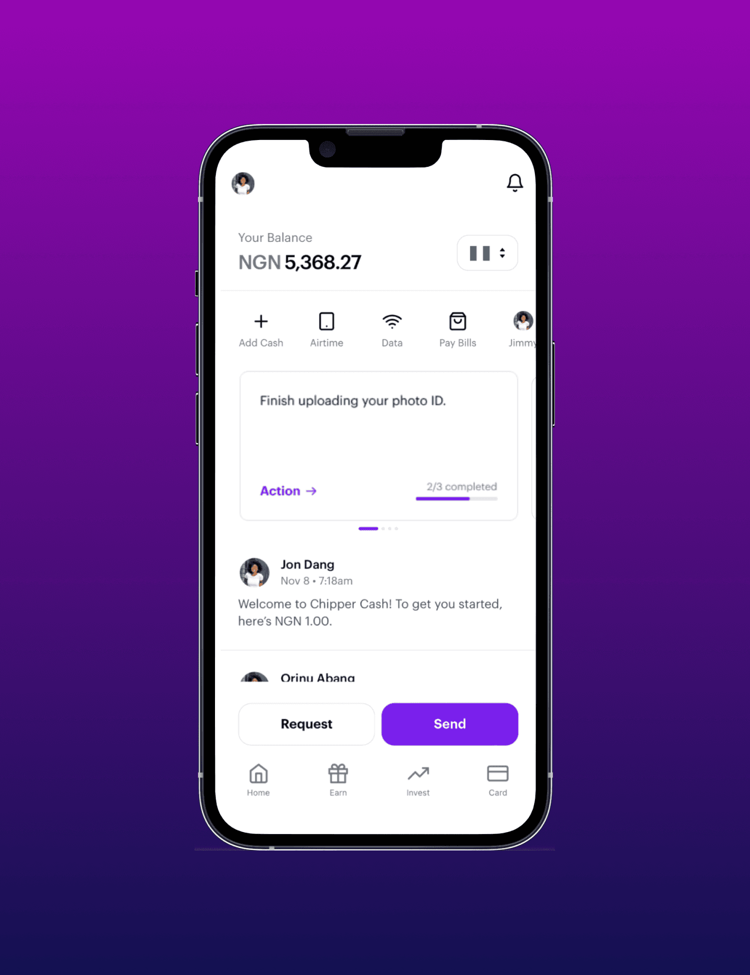
An iphone opened on the Chipper Cash app home page - used to facilitate cross-border payments in Africa

Chipper

Chipper

Chipper

How we designed a solution that leveraged generational mentorship in rural communities

How we designed a solution that leveraged generational mentorship in rural communities

How we designed a solution that leveraged generational mentorship in rural communities

Industry

fintech

Services

fintech

Designing Chipper 2.0

Designing Chipper 2.0

Designing Chipper 2.0

A pan-African fintech focuses on enhancing the cross-border payment experience through redesigning for user centricity
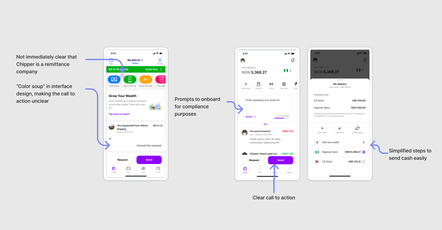
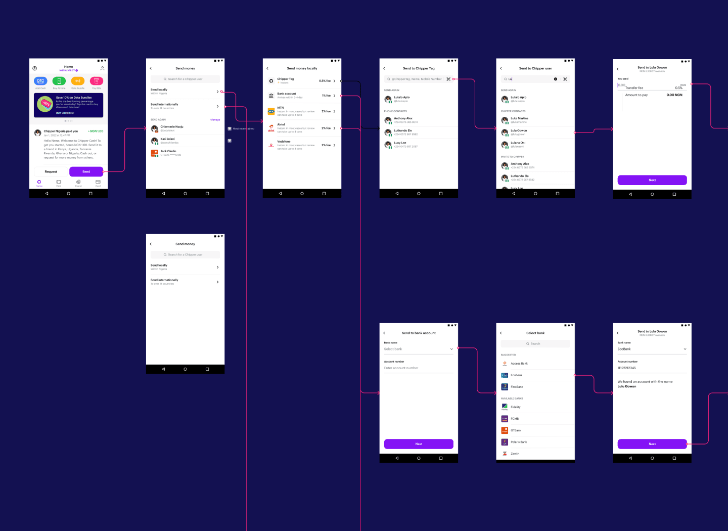
A mapping of early user flows depicting the original "Send" cross-border functionality using images of the screens UI designs - featuring overwhelming and confusing colours on the home screen

Early user flows depict the original "Send" cross-border functionality. Note the "color soup" on the home screen (far left), which often contributed to user confusion regarding next steps.

Chipper Cash is a fintech platform that offers mobile, cross-border money transfer services for Africans and the African diaspora worldwide. At the time, the ability for customers to easily send money cross border was the most crucial for the business. During their rapid expansion, Chipper concentrated deeply on product development. As they ventured into new markets however, we quickly noticed an increase in drop offs after users reached the home screen. Recognizing the need for more intuitive usability and design, we embarked on a “Chipper 2.0 initiative” to redesign the “Home” and “Send Money” user flows.

International remittances terminating in mobile-money wallets grew by 65 percent year over year in 2020 to around $1 billion


Digital wallets that are linked to a variety of payment methods, including cards, accounts, and mobile money, are growing in availability and adoption.

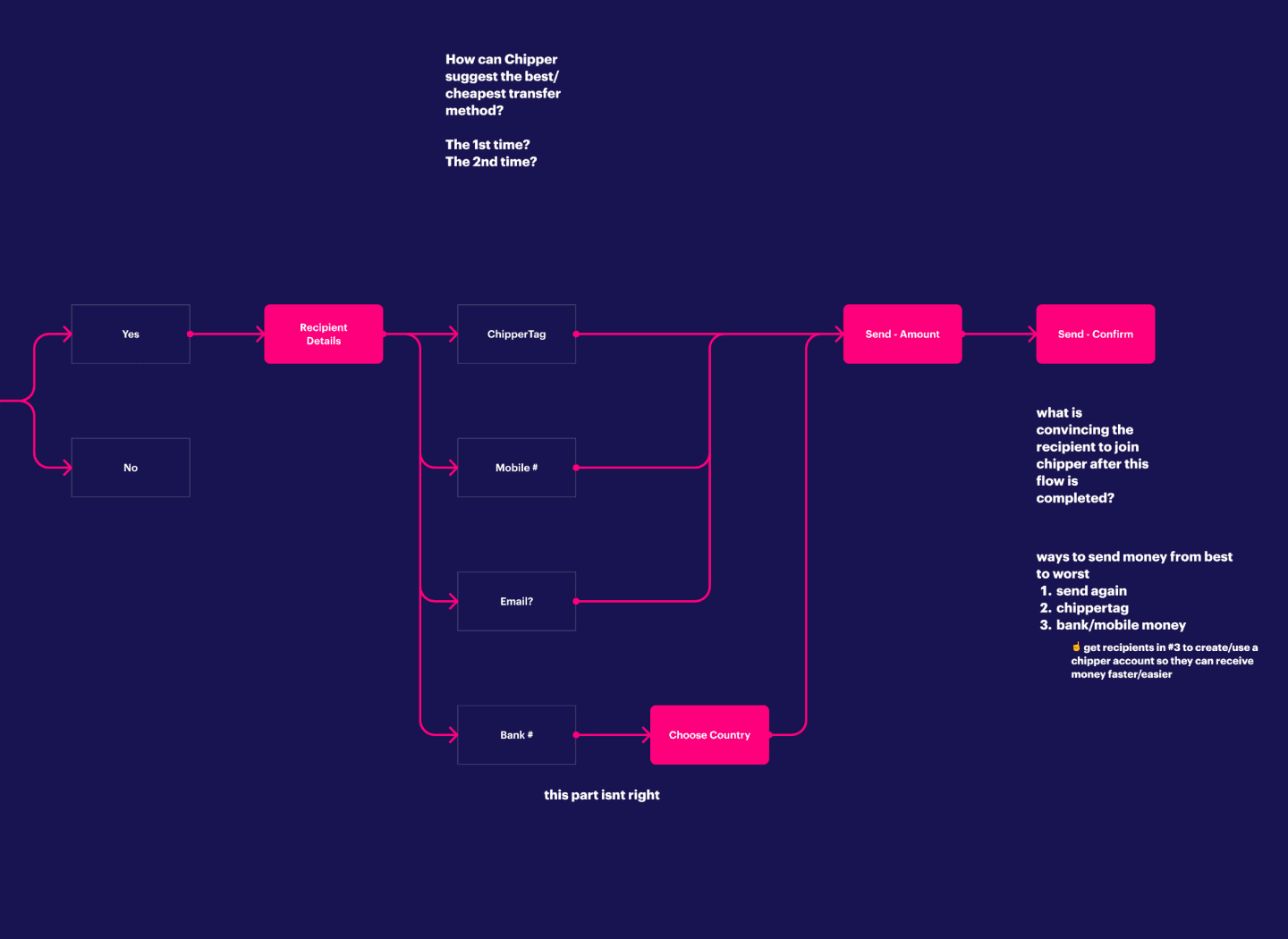
A flow diagram using blocks and arrows depicting the process of mapping new user flows, focusing on improving cross-border transfer experiences

We started the process of mapping new user flows, focusing on improving cross-border transfer experiences and integrating UI/UX features to suggest the most affordable or efficient methods.

Despite Chipper's wide customer base, insufficient insights into user experiences obscured crucial pain points and opportunities for wider app adoption.

To address this, we engaged in extensive user research across Nigeria and Uganda, eventually narrowing our focus to Ugandan freelancers due to the market's stability. Across all the user groups we interviewed: students, suppliers, salaried employees, agents, and parents, freelancers particularly benefitted from Chipper's fast remittances. These customers often have employers or clientele from different countries, were more tech savvy (owned a smartphone), and wanted more ways to invest and spend.

Before and after comparison of the original "Send" home screen of Chipper Cash's fintech app compared to the updated "Send 2.0" screen with a clearer and simpler interface featuring fewer colours and clearer steps

Before and after comparison of the original "Send" home screen, vs. "Send 2.0"

Our insights highlighted elements of the app that were most important to Chipper users. The majority of customers emphasized the need for clearer fee displays and payment summaries prior to confirming the transaction. Now with clear design requirements in mind, we were able to reimagine what it might look like for the Chipper app to better serve these freelancers.

Building “Chipper 2.0” required stakeholder buy-in from all departments: product, marketing, engineering, revenue. We implemented a new and rigorous iteration process that kept user experience at the forefront of our designs, and also maintained alignment with all cross-functional leaders. The new version aimed for simplicity and efficiency in fund transfers, addressing compliance needs, and using visual cues to prompt users towards a clear “call to action.” As a result, the project culminated in the successful deployment that all teams were proud of. The final design was simpler, easier to navigate, and guided users towards a smoother journey to send their funds.

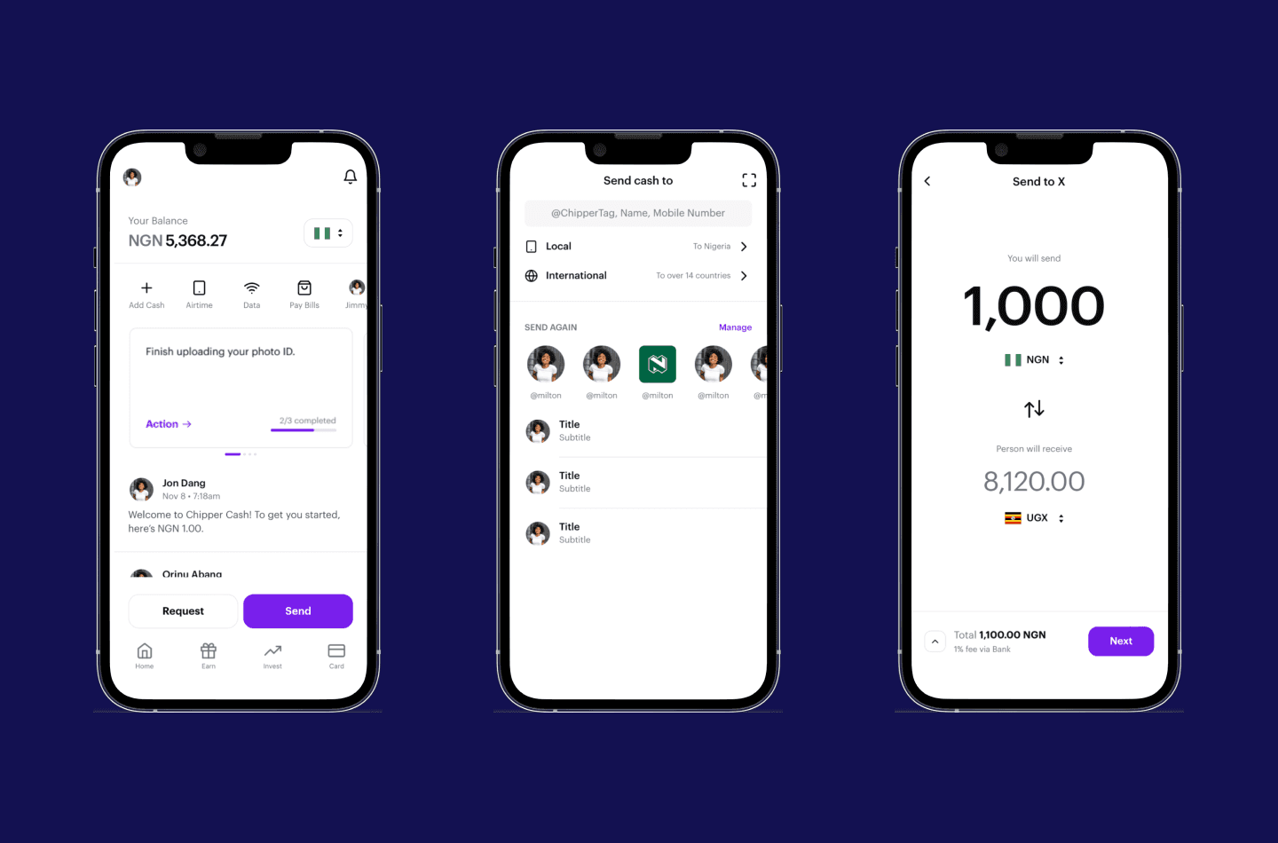
The final UI designs for Chipper Cash's new "Send" user flow with a clearer and simpler interface featuring fewer colours and clearer steps

Final design of Chipper's "Send 2.0," with a clean user journey and aesthetic we were all proud of 🙂
TURN YOUR IDEAS INTO REALITY

Let's Create Something Extraordinary Together!

Tell us a little about your project, and one of our team members will reach out soon.

Vibrantly coloured abstract swirling object to represent the blend of innovative technology, strategy, design and digital experiences

TURN YOUR IDEAS INTO REALITY

Let's Create Something Extraordinary Together!

Tell us a little about your project, and one of our team members will reach out soon.

Vibrantly coloured abstract object swirling on the page to represent the blend of innovative technology, design and digital experiences

TURN YOUR IDEAS INTO REALITY

Let's Create Something Extraordinary Together!

Tell us a little about your project, and one of our team members will reach out soon.

Vibrantly coloured abstract swirling object to represent the blend of innovative technology, strategy, design and digital experiences

How might we design a better world?

Copyright ©2024 the Kumquat. All rights reserved.